Empowering campus support staff with convenient access to skill-enhancement resources to foster their professional development.
Vidyam is a mobile-based learning application designed to provide campus support workers with opportunities to enhance their skills in an intuitive and user-friendly way. The platform focuses on reducing barriers such as language, time constraints, and digital literacy, which traditionally limit access to learning resources. Using a card-based layout, minimal reliance on text, and integration of local language support, Vidyam caters to users with varying levels of familiarity with technology. Our goal was to create a prototype that is not only functional but also empowering, fostering an environment where learning becomes accessible for all.
Overview
The problem was clear: campus support staff, though motivated, had limited opportunities to access educational resources. Many lacked formal education or were not proficient in English, while others were unfamiliar with digital interfaces or had limited time due to demanding work schedules. Existing educational platforms were primarily geared toward literate, tech-savvy users, making them unsuitable for this target group. This lack of access hindered the personal and professional growth of these individuals, despite their willingness to learn. On an initial survey of 20 underprivileged workers,
Problem
90%
workers found existing educational platforms too complex and difficult to navigate
85%
campus support staff expressed a desire to improve their skills but lacked access to formal training programs
100%
of the target user group primarily speaks local languages, with limited fluency in English
Hypothesis
We hypothesized that creating a platform with the following features would significantly increase user engagement and learning outcomes:
A simple interface with a card-based layout to aid navigation.
Local language support to ensure users could understand the content and navigate the app without confusion.
A focus on skill-building exercises that align with the daily challenges and interests of the campus support staff.
The integration of flexible learning pathways, allowing users to learn at their own pace, despite time constraints.
Limited Access to Users: Our ability to interact with users was restricted to their working hours, so interviews and testing were conducted in small windows of time.
Language Diversity: The support staff came from different linguistic backgrounds, requiring the app to accommodate multiple languages while keeping the user interface consistent.
Digital Literacy: Many users were not familiar with smartphones or apps, leading to a design that needed to be highly intuitive, with visual and audio cues over textual explanations.
Constraints
User Personas
Security Guard
Ravi, 35
Ravi has been working as a campus security guard for eight years. He takes pride in his job but wishes to enhance his skills to explore other opportunities, such as learning basic computer skills or improving his spoken English. Ravi owns a smartphone but primarily uses it for calls and messaging, as he is unfamiliar with most apps. His schedule is demanding, leaving him with little time for learning, especially during work hours.
Background
Limited digital literacy, lack of time, and unfamiliarity with English. He struggles with complex interfaces and prefers simple, visual-driven interactions.
Challenges
Needs
An easy-to-navigate platform in his local language, short lessons he can engage with in small intervals, and a support feature that can help him when he gets stuck.
Meera, 31
Housekeeping Staff
Meera has been working in campus housekeeping for over a decade. She is interested in learning new skills, particularly in areas like personal finance, health, and communication. However, she has never had formal schooling and relies heavily on her local language (Hindi) for communication. She is motivated to improve her skills but is intimidated by digital interfaces, especially those filled with text or unclear instructions.
Background
Meera feels overwhelmed by text-heavy interfaces and is uncomfortable with English. She needs clear, straightforward guidance and a support system within the app to help her navigate challenges.
Challenges
Needs
A platform with minimal text, local language support, simple visuals, and clear, step-by-step instructions.
Process Overview
Discover: We began by conducting ethnographic research and interviews with the target group (campus support staff), to identify their specific pain points and challenges.
Define: From this research, we narrowed the problem to two core issues: lack of accessible learning resources and an unintuitive digital experience.
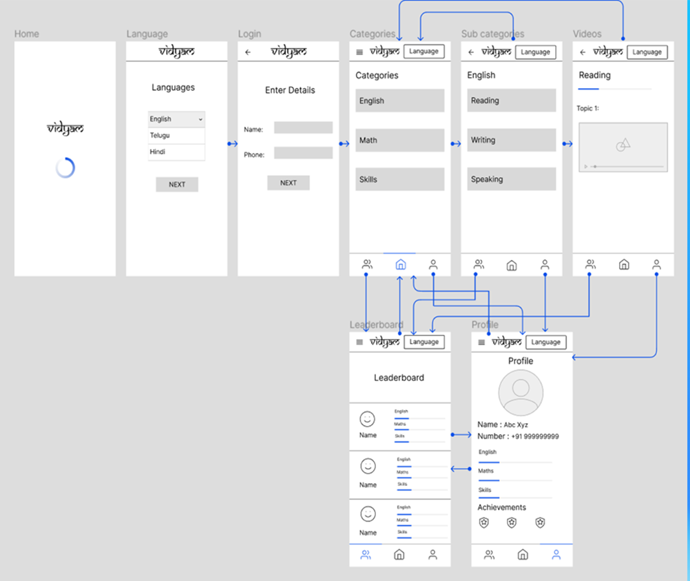
Develop: In this phase, we brainstormed solutions, iterated on wireframes, and created low-fidelity prototypes. These prototypes focused on easy navigation, and language inclusivity.
Deliver: Finally, we developed a high-fidelity Figma prototype, tested it with users, and refined the design based on feedback.
The project followed the Double Diamond Design Process, structured into four key phases:
Ideation
Card Based Layouts with large icons representing various learning modules.
Local Language Support that allowed users to select their preferred language.
Minimalist Design focusing on functionality rather than aesthetics, ensuring that users could complete tasks with minimal cognitive load.
A TTS Button that allows users to read out titles and instructions, making the content more accessible and easier to understand.
Our ideation phase was driven by one core objective: create an app that is not intimidating for low-literate users. This led to brainstorming sessions that emphasized:
Design Process
After the ideation phase, we transitioned into the design process, where our concepts were brought to life through iterative prototyping and user testing. We started by making a pen and paper sketch, followed by low-fidelity wireframes to map out the app’s core structure, focusing on simple, user-friendly navigation and a visually intuitive interface. As we moved to higher fidelity prototypes, we incorporated feedback from initial user testing sessions, which helped us the refine key elements.
Pen and Paper Sketch
Low Fidelity Prototype
Testing
Navigation Challenges: Some users had trouble distinguishing between buttons, leading us to refine the button sizes.
Help Feature: The help button became a central feature, with users requesting more guidance on specific tasks.
Minimalist Design focusing on functionality rather than aesthetics, ensuring that users could complete tasks with minimal cognitive load.
A TTS Button that allows users to read out titles and instructions, making the content more accessible and easier to understand.
Some key insights we got from testing were:
Prototype
Learning
The central hub for accessing and navigating educational modules, designed for clarity and ease of use. Users can filter modules by English, Math, or Skills, or view all content at once. Each module card displays key details like progress percentage and module position in the course, helping users track their learning journey and stay motivated. A mic button near the title, “Choose a Category,” offers voice assistance for enhanced accessibility.
Module Page
This page is designed to provide a focused and streamlined learning experience. At the top, users can watch the course video, serving as the primary learning material. Below the video, related notes are displayed, offering additional context and key takeaways to reinforce understanding. The layout ensures easy access to both visual and textual content, allowing users to seamlessly transition between video learning and note review.
Help
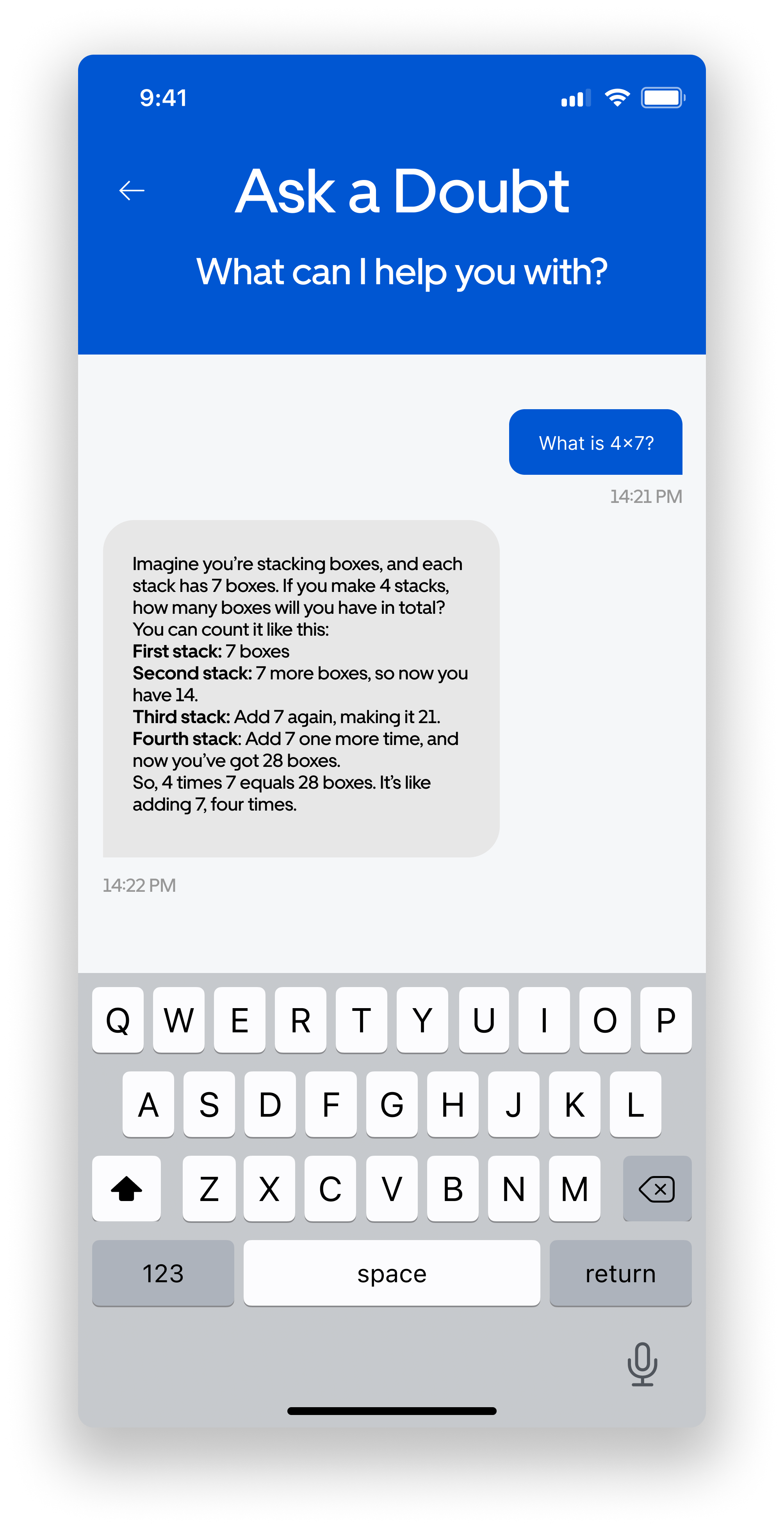
The Help Page is designed to provide users with quick and reliable support. A 24/7 chatbot is available to address doubts, offering clear and easy-to-understand answers. With its conversational interface, the chatbot ensures users can resolve issues or gain clarity on topics in real-time, without navigating complex support systems.
Leaderboard
This page fosters engagement and friendly competition by showcasing user rankings. Users can view their placement alongside their friends based on today’s, this week’s, or all-time points. The dynamic filtering options ensure users can track short-term progress or long-term achievements.
Profile
The Profile Page is a personalized space for tracking progress and customizing the experience. Users can add friends to build a community, switch languages for accessibility, and view achievements through earned badges. A detailed progress summary keeps users motivated, while the design highlights personalization and celebrates milestones.
Here’s how the platform looks in two local languages, namely telugu and hindi.
Lang: Telugu
Lang: Hindi
Reflections and Key Learnings
This project reinforced the importance of user-centric design and the need to continuously iterate based on real user feedback. We learned that designing for inclusivity goes beyond mere translation—it requires understanding the user’s environment, literacy level, and day-to-day challenges. Our testing phase revealed the critical role of simple, clear visuals and the power of an accessible help system in reducing cognitive load. Moreover, working on Vidyam gave us insights into how to design products for low-literate users in a dignified, empowering way. Going forward, we intend to apply these lessons to future projects, with an increased focus on empathy and accessibility in our design process.
Collaborators
Rohan Kannegulla
Riya Wairagade
Afrin Karim
Sravika Linga


